
Monday 9 May 2011
Thursday 28 April 2011


Final double page story page!
Just in case you couldn’t read what the text says when reading it on the actual double page spread, this is a copy of the paragraphs.
The biggest thing to hit R’n’b since 1996 the Big toe is taking the music industry by storm. BT as he more commonly known stomped on the scene with his first solo record Addidas stripes, which went straight to number one, he has been hitting us with fresh tunes ever since.
The up and coming white British Liverpool born, kick boxing black belt rapper tells us how he was bored of listening to the same old two singers, two guitarist boy bands that where coming out of Liverpool’s music industry. His varying style and unique voice make him stick out from other artists that are trying to break onto the scene.
Coming from Maghull one of the toughest areas in Liverpool the Big Toe faced many difficulties in finding people to sign him onto their record label, but when Star records made the discovery of BT they knew he was a ‘star’ straight away. BT told JCM that his main inspiration to become a R’n’B artist was the great Jay Z BT said that once he heard the black album he knew what he wanted to do in life.
BT says off course the Beatles coming from Liverpool shows that big music can come from the heart of the city. He says in his confident way that he can become the next biggest thing to come from Liverpool since the fantastic four. For someone so young this is a huge comment to live up too, but from what we have seen from him so far ‘the sky really is the limit’.
The big toe is making his very first festival appearance in the near future by headlining the V festival in the summer with huge artists including Rihanna and Eminem as well as Plan B, he can wait and is looking forward to spit his tunes and wowing the crowd as he has promised to do whenever he performs.
The latest thing we have heard from BT is the record breaking first album ‘The Breakthrough’ which stayed at the top of the R’N’B charts for 7 and a half weeks the album boasts 6 number one hits and 3 other top ten tunes, you will be able to see him live on the break through tour in the near future as he wants to start just before the festival season so that he can make it in time for his headlining act at the V festival. The big toe is currently working on his new album which is out on the 28th April revealing exclusively to us that it will be called ‘Here to stay’, he has revealed his first song on the album that will be revealed a week earlier will blow our minds, It’s that good.
Throughout the interview with BT he seemed very relaxed and confident just like he does when you see him on the television and here him on your radios, he was open and honest with us and seemed to be very focused and determined to become the very best. He compares himself to he likes of Jay Z and the Beatles and were not arguing JCM thinks the big toe can make it all the way in the business.


Wednesday 27 April 2011
Tuesday 8 March 2011
Mock pitures!
These are shots that I took on my photo shoot whilst attempting to get around 3-4 good shots that I could us in my actual music magazine, these are the shots that I believed didn’t look right or I didn’t think they were right for the music magazine, so these pictures won’t be making it into my actual music magazine when I finally start to create it.
1) In the first picture you see my actor standing near a stone memorial statue the extreme long shot of Sean doesn’t look as good as I had thought it might of, I took another picture of him closer up and this may be a better picture to use in the magazine.
2) In the second picture of Sean standing on the bridge the light in the background had an effect on the camera lens and shadowed around Sean making the image of him look too dark, also his facial expression wasn’t professional enough as he was laughing at the time of the shot.
3) The third shot of Sean isn’t really what I wanted I thought that if I had a disguised picture of him then it might be a mysterious and possibly draw audiences in to reading the magazine but when I looked at it again I realised that it looked like a blooper shot as if I didn’t mean to take it.
4) The fourth shot that I have decided to be a mock shot was a picture that at the time I thought looked good however when placed on the computer I saw that you can’t really see Sean through the lightness of the sun and also the extreme long shot is just too far away for you to see him anyway, and you can’t actually see who is in the picture.

Production Log!
The production log was kept so that I could keep an eye on what I had to do over the course of creating my media blog, it kept me in time and made me work hard so that I would make sure I published all my posts on time and in order.


Risk assessment form, People at risk form, Contributors release form!
The risk assessment form contributors release form and people at risk forms were necessary forms that I had to complete in order to prove that I took the right precautions to keep myself and my actor, who is going to be in the main article in my magazine of a new up and coming white British rapper, would be safe, they were necessary to me so I could make sure that any risks could be removed from the situation, and we could work in a safe environment.


ACTOR
Sean Foot
COSTUME
I made sean wear a hoody as it adds to the look of a rapper I also made him wear dark jeans as I thought they looked better than lighter coloured jeans, I also made him wear trainers as I beleived that this made him look better.
VENUE
The venue I took the pictures in was behind a disused pub in kirkdale close to the station I chose to take the pictures hear as I thought it added to the look of a rapper being hard and tough, I also took pictures through an alley way near the everton ground I did this because io thought it looked good and added to seans look.
Monday 28 February 2011


Front cover mock up!

The folowing mock up templates are only the original documents and I may change them along the course of creating my actual front cover, contents page and double page spread, if i find it neccessary to do so to create a better design.
2 Contents Page analysis!
Analysis of ‘NME’ contents page
NME magazine is probably the biggest music magazine in the music market this is why I chose to analysis it.
As you can see the contents page stays in line with the outside of the magazine from my front cover analysis the black and red colour scheme is the same, this is because the magazine wants to make sure it looks professional and look as though the magazine would be a good read through out.
You know that it is the contents page and you know what is going to be in the magazine as it says NME this week at the top, you will know what the main story is as the main picture on the contents page shows it.
Down the right hand side of the contents page it shows what is going to be in the magazine this is good as if somebody wanted to quickly glance down at the page to look what was going to be appearing in the magazine to check if they wanted to read it and buy it.
It gives an A-Z list of all bands that have appeared in articles though the years of NME’s history showing how good the magazine is and how good it has been, proving that it is a quality source of music information and attracting people to read it.
It also gives details of how you would subscribe to NME magazine with links to its internet as well as a phone number and a text mobile number you can phone if you want any further information or wish to have an issue of the magazine regularly.
It also gives the date showing that you are getting the latest information from music around, it also allows people to keep up to date on whether they have the right magazine and if they are collectors they can have ll the right magazines.
The font in the little writing stays the same but the main parts of the text are bolder and bigger, showing that people should look at them and attract you to looking at it.

Analysis of vibe magazine contents page
I chose vibe magazine as it is music magazine giving information from my chose genre and it is also a good magazine.
The contents page is like the front page in many cases as one picture is the centre of attention and makes you look at it, you know that the artist on the front is going to be one of the leading stories probably the main story as soon as you pick the magazine up and look in it.
It is very plain with only a little bit of information down the left hand side of the contents page showing the features of the magazine, this is good as people can instantly glance at these features and decided whether or not they want to pick up and read the magazine.
It says contents page 1/3 showing that it isn’t the only contents page which is an interesting way of finding what is going to be in the magazine having to look through 3 contents pages, this is unique and people will look at it and think that there must be a lot of articles n the magazine and this will make them buy the mag.
There is also a little date line at the bottom of the page so that people can keep track on the dates and time periods of the magazines.
The main picture in the centre is there to make the magazine appealing to its audience, and the colour scheme purple shows that the magazine is acceptable for both genders

2 Double Page spread analysis!
Amy Winehouse Double page spread
I chose to do the Vibe Amy Winehouse double page spread because it is from my music genre and shows a few things that i can talk about.
One of the main reasons I chose it was that it is a very good way of showing feminism in the media as it is a very male orientated spread as she is in a little pair of shorts and a top this would attract men to reading this article as it is appealing to them in an attractive way.
There is also a pun in the main heading as well as a link with the picture and the words, we can see that in the heading it says ‘Amy’s ink house’ this is because she has a few tattoos and also she has opened as a tattoo artist as it says in the article. This is also linked to her name as her name is Amy Winehouse and the article then says ‘ink house’.
The heading is linked to the story in another way as well as the heading is done in ink like writing with a big blob dropping down the page just to add with the ink house Winehouse link.
The article shows what Amy is like really as it is an interview from her own tattoo house, it jokes around when in the article it says amy has a door mat which says ‘GO AWAY’ showing the readers her personality, as she has become a folk devil in the eyes of the public with people liking to dislike her.
In the article it says that Amy apologises for being late, this makes you think she was late by a lot but she was only late by 4 whole minutes as the author jokes around saying.
The interview is short and sweet, but it shows you a lot about her as a person and what she is up to in her life and a little incite to her world, this is a good way the magazine can increase sales as little article like this one may encourage people into buying the R&B ‘vibe’ magazine.

Analysis of ‘NME’ double page spread
The first double page spread is from the magazine ‘NME’ which Is probably the most commonly known music magazine.
In this double page spread you can see that the headline is one third of the way down the page, this is informality shows that the magazine is trying different things and is showing that the magazine is supposed for relaxed reading, that you could pick up and put down whenever you wanted to.
There is a big quote in the centre of the article this shows that it may be an important part of the article and it will grab the attention of the readers making them want to read through the article in depth.
The text is all the same right the way through same size and font going down the page in three section apart from in two place one being the big quote and the other is the huge letter t at the start of one of the paragraphs, this is another way of getting the reader to look at the article and look at that part of it as it is the section talking about her new album possibly getting people to buy it, it is a common trait often used in music magazines.
There is a clever pun in the top sun heading as it says ‘things have turned a lot darker in lykke li world and were not just talking about her hair’ as she was once blonde, this also makes people want to read on and find out about the other things turning dark in her life.
There is an opinion of her behaviour from the author in the first paragraph showing informality and is drawing the readers in as they want to know why he thinks this.
There is a three alliteration sentence of adjectives this sets the scene for the paragraph and for the author to express these adjectives, it describes her as a singer and person, there is a discography in the paragraph showing all of her previous songs this is advertising her previous work and allows for people reading to look for her already released songs.
The article isn’t as formal as a newspaper article this is so that you feel as though you are actually hearing or talking to the artist yourself, there is also a swear word used in the article this is so that it feels as though you are listening to the artist and she is speaking to you personally giving a sense of the artists voice in the article.
There is also a list of bands that are related to her type of music so that the magazine is pointing out songs you may like if you like lkke li’s music this is here so you may think to buy it again for music hints.


Thursday 24 February 2011
photo shop practice!
This is the photo shop practice that I chose to do I selected the scream mask from the internet and changed a few of the colours and the background of it to make it look different from its original state.

Wednesday 23 February 2011
Mood Board!
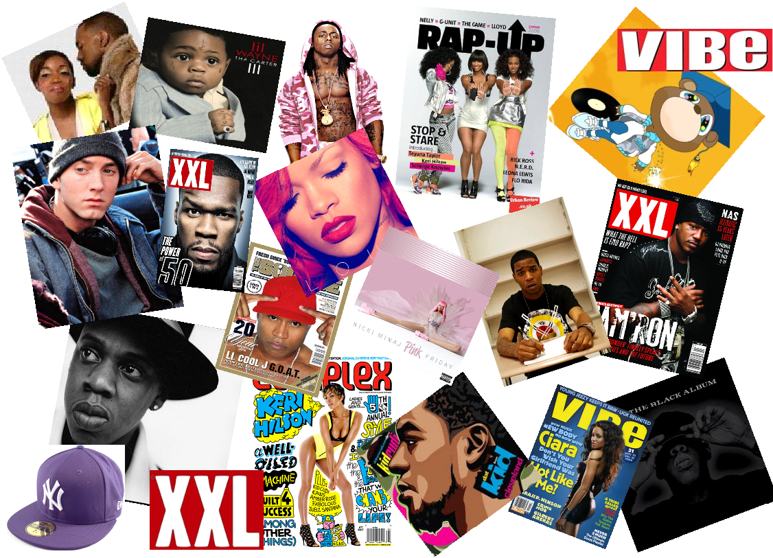
This is my mood board with some of the artists from the genre of music my magazine is going to be about, and the style of music I like to listen to.
Monday 14 February 2011
Analysis of 2 Music magazine covers!
These are two magazine front covers that are already in the music magazine market that I will analysis shoewing the media vocabulary that can be used to describe the features on the front of magazines, I will be describing ‘VIBE’ magazine from my genre I have decided to do and also ‘NME’ one of the biggest music magazines around.
VIBE

NME

My college newsletter!
This is my own college newsletter that I have made in publisher, I used the mock design and tried to make it as near the same as i could, I only made a little cahnge to the name of the newsletter I moved it slighlty to the left so that you could see the White writing, as you couldnt see it when it was behind the yellow pug star, everything else is the same as the mock layout version I created.

I used the blue as the background cover as it is the colour associated with Deyes High School, as it is the colour of the shirts they wear.
The pictures used in the Newsletter front cover are ones that I took of the ‘Lydiate’ building, the main school building and the new ‘wow’ building, as this is what the main story line is all about.
I used the same font in all the writting on the front cover from the Issue number to the main headline, trying to make it look good, I used the colour yellow in the pug as I realised it would stand out dramatically on the blue background catching the eye of the readers.

Mock college newsletter layout!
This is the Mock layout that I have made in Microsoft word using many different shapes and text boxes in order to make a shape and a layout that I will use when making the actual school newsletter with pictures that I have taken myself.

Analysis of college newsletter!
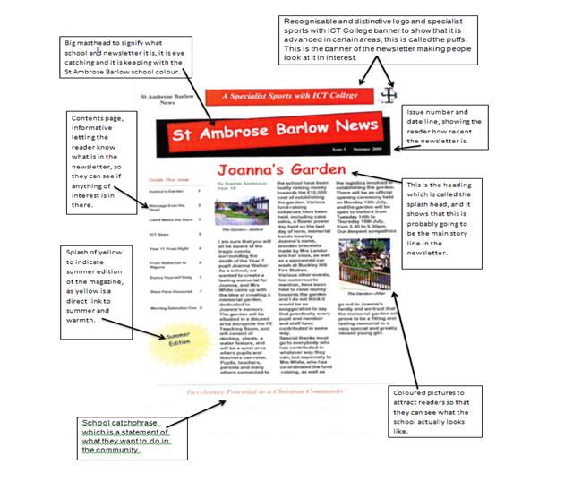
This is the analysis i made of the Deyes newsleter annotating it and describing what each part is.

Thursday 10 February 2011

Feminism!
Feminist believe that the media’s outputs of a product is very patriarchal or male dominated, Feminism was the response to society believing that women were seen as objects or less of a person than men. They believe this because of the fact that the sex equality act was only passed in 1975, and because of Laura Mulvey’s theory of the male gaze that the media is created by men for men, arguing that audiences look at films in two ways voyeuristically and fetishistically.
She argues that Voyeurism turns the figure into a fetish in the way that they have to be perfectly beautiful and admired turning women into objectified characters on the screen, She believes that or women to become movie stars they have to be beautiful and glamorous, as to be approved by the male gaze.
She believes in this theory as the men are always the main protagonists they are the main actors who are in the fighting seems to save the women or protect her, this show that the man is powerful and the women is there for eye candy on screen for the male gaze for a male audience.
Cohens Moral panic!
Cohen’s moral panic is a way that media can be used to show a certain person, persons, condition in a certain way that appears to threaten society in some way. This thought was brought to life by a man named Stanley Cohen who said that panic can cause a condition, episode, person or group of persons to be looked at as a threat to society presented in a stereotypical fashion by the media on a mass scale, people in social power can stir up feelings of panic selecting how these things a viewed and when the media decides to show these in a bad way ‘Folk Devils’ are made, these are people that need help to be controlled this is where the panic start to kick in.
‘Folk Devils’ are created by the media who use the evidence of something and exaggerate the truth by adding more people in an attack or increasing the violence used in a riot for example, the writer of the piece wrote about the ‘Folk Devil’ will be very vocal in their piece and this will effect what the widespread general thought of society, they are greeted by the public by a great deal of hostility in the sense of a “them” and “us” type of way, however they are very short lived as it is hard to sustain the story on a long term bases.
Monday 7 February 2011
Media vocabulary!
Vocabulary that describes the features that appear on a magazine front cover,
These are words that are used to describe front covers of magazines, as they are features that appear on a front cover when reading a magazine.
Masthead: This is the title of the magazine such as ‘NME’
Anchorage text: The way the positioning of the text can help signify the importance of a picture.
Puffs: These are stand out parts of a magazine promoting the contents inside.
House style: The memorable design of a magazine that is memorable, so people know it from competitor’s magazines.
Buzz words: These are words that attract you to a magazine such as “exclusive” or “new”.
Banner: This is text usually on a noticeable coloured background, one of the main articles in the magazine usually.
Pugs: These usually appear in either of the top corners on the front page of the magazine, often referred to as the ears of the magazine front cover, the price can be found here.
Head line: Often a play on words for the main article in the magazine, that is catchy and appealing.
Semiotic Theory!
Semiotics is the theory of a man named Saussure who stated that “in everything there is a sign and a signified” this means in every word, symbol, image and sound can have other connotations, this means that if you gave somebody else a red rose this can show that you love them, the red rose is the signifier and the signified is the love you feel for that person you gave the red rose to, this can be linked to a music magazine as if a woman was on the front cover of a magazine with swim wear on this could signify sex appeal in the magazine.
Thursday 27 January 2011
Questionnaire!
Alright everyone can you take the time to answer this music questionnaire please!
click here to complete.


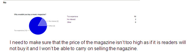
click here to complete.


Thursday 20 January 2011
Introduction to coursework!
In the coursework task set i will be using Desk Top Publisher and image manipulation program to produce the front cover of a new music magazine, featuring a photograph of somebody in a medium close-up using appropriate text and a title of the magazine.
The main task is to create a main page and a contents section with a double page in side spread related to music i can do this in a group of a maximum of 4 members, i will research how best to do the magazine by looking at the current range of magazines on offer in various shops, looking how they set their magazine up, seeing who the potential target audience is.
I will eventually be evaluated on how well i have used the technology to create a front page, contents and a double page spread in my coursework whilst managing my time.
Subscribe to:
Posts (Atom)