
Monday, 28 February 2011

Front cover mock up!

The folowing mock up templates are only the original documents and I may change them along the course of creating my actual front cover, contents page and double page spread, if i find it neccessary to do so to create a better design.
2 Contents Page analysis!
Analysis of ‘NME’ contents page
NME magazine is probably the biggest music magazine in the music market this is why I chose to analysis it.
As you can see the contents page stays in line with the outside of the magazine from my front cover analysis the black and red colour scheme is the same, this is because the magazine wants to make sure it looks professional and look as though the magazine would be a good read through out.
You know that it is the contents page and you know what is going to be in the magazine as it says NME this week at the top, you will know what the main story is as the main picture on the contents page shows it.
Down the right hand side of the contents page it shows what is going to be in the magazine this is good as if somebody wanted to quickly glance down at the page to look what was going to be appearing in the magazine to check if they wanted to read it and buy it.
It gives an A-Z list of all bands that have appeared in articles though the years of NME’s history showing how good the magazine is and how good it has been, proving that it is a quality source of music information and attracting people to read it.
It also gives details of how you would subscribe to NME magazine with links to its internet as well as a phone number and a text mobile number you can phone if you want any further information or wish to have an issue of the magazine regularly.
It also gives the date showing that you are getting the latest information from music around, it also allows people to keep up to date on whether they have the right magazine and if they are collectors they can have ll the right magazines.
The font in the little writing stays the same but the main parts of the text are bolder and bigger, showing that people should look at them and attract you to looking at it.

Analysis of vibe magazine contents page
I chose vibe magazine as it is music magazine giving information from my chose genre and it is also a good magazine.
The contents page is like the front page in many cases as one picture is the centre of attention and makes you look at it, you know that the artist on the front is going to be one of the leading stories probably the main story as soon as you pick the magazine up and look in it.
It is very plain with only a little bit of information down the left hand side of the contents page showing the features of the magazine, this is good as people can instantly glance at these features and decided whether or not they want to pick up and read the magazine.
It says contents page 1/3 showing that it isn’t the only contents page which is an interesting way of finding what is going to be in the magazine having to look through 3 contents pages, this is unique and people will look at it and think that there must be a lot of articles n the magazine and this will make them buy the mag.
There is also a little date line at the bottom of the page so that people can keep track on the dates and time periods of the magazines.
The main picture in the centre is there to make the magazine appealing to its audience, and the colour scheme purple shows that the magazine is acceptable for both genders

2 Double Page spread analysis!
Amy Winehouse Double page spread
I chose to do the Vibe Amy Winehouse double page spread because it is from my music genre and shows a few things that i can talk about.
One of the main reasons I chose it was that it is a very good way of showing feminism in the media as it is a very male orientated spread as she is in a little pair of shorts and a top this would attract men to reading this article as it is appealing to them in an attractive way.
There is also a pun in the main heading as well as a link with the picture and the words, we can see that in the heading it says ‘Amy’s ink house’ this is because she has a few tattoos and also she has opened as a tattoo artist as it says in the article. This is also linked to her name as her name is Amy Winehouse and the article then says ‘ink house’.
The heading is linked to the story in another way as well as the heading is done in ink like writing with a big blob dropping down the page just to add with the ink house Winehouse link.
The article shows what Amy is like really as it is an interview from her own tattoo house, it jokes around when in the article it says amy has a door mat which says ‘GO AWAY’ showing the readers her personality, as she has become a folk devil in the eyes of the public with people liking to dislike her.
In the article it says that Amy apologises for being late, this makes you think she was late by a lot but she was only late by 4 whole minutes as the author jokes around saying.
The interview is short and sweet, but it shows you a lot about her as a person and what she is up to in her life and a little incite to her world, this is a good way the magazine can increase sales as little article like this one may encourage people into buying the R&B ‘vibe’ magazine.

Analysis of ‘NME’ double page spread
The first double page spread is from the magazine ‘NME’ which Is probably the most commonly known music magazine.
In this double page spread you can see that the headline is one third of the way down the page, this is informality shows that the magazine is trying different things and is showing that the magazine is supposed for relaxed reading, that you could pick up and put down whenever you wanted to.
There is a big quote in the centre of the article this shows that it may be an important part of the article and it will grab the attention of the readers making them want to read through the article in depth.
The text is all the same right the way through same size and font going down the page in three section apart from in two place one being the big quote and the other is the huge letter t at the start of one of the paragraphs, this is another way of getting the reader to look at the article and look at that part of it as it is the section talking about her new album possibly getting people to buy it, it is a common trait often used in music magazines.
There is a clever pun in the top sun heading as it says ‘things have turned a lot darker in lykke li world and were not just talking about her hair’ as she was once blonde, this also makes people want to read on and find out about the other things turning dark in her life.
There is an opinion of her behaviour from the author in the first paragraph showing informality and is drawing the readers in as they want to know why he thinks this.
There is a three alliteration sentence of adjectives this sets the scene for the paragraph and for the author to express these adjectives, it describes her as a singer and person, there is a discography in the paragraph showing all of her previous songs this is advertising her previous work and allows for people reading to look for her already released songs.
The article isn’t as formal as a newspaper article this is so that you feel as though you are actually hearing or talking to the artist yourself, there is also a swear word used in the article this is so that it feels as though you are listening to the artist and she is speaking to you personally giving a sense of the artists voice in the article.
There is also a list of bands that are related to her type of music so that the magazine is pointing out songs you may like if you like lkke li’s music this is here so you may think to buy it again for music hints.


Thursday, 24 February 2011
photo shop practice!
This is the photo shop practice that I chose to do I selected the scream mask from the internet and changed a few of the colours and the background of it to make it look different from its original state.

Wednesday, 23 February 2011
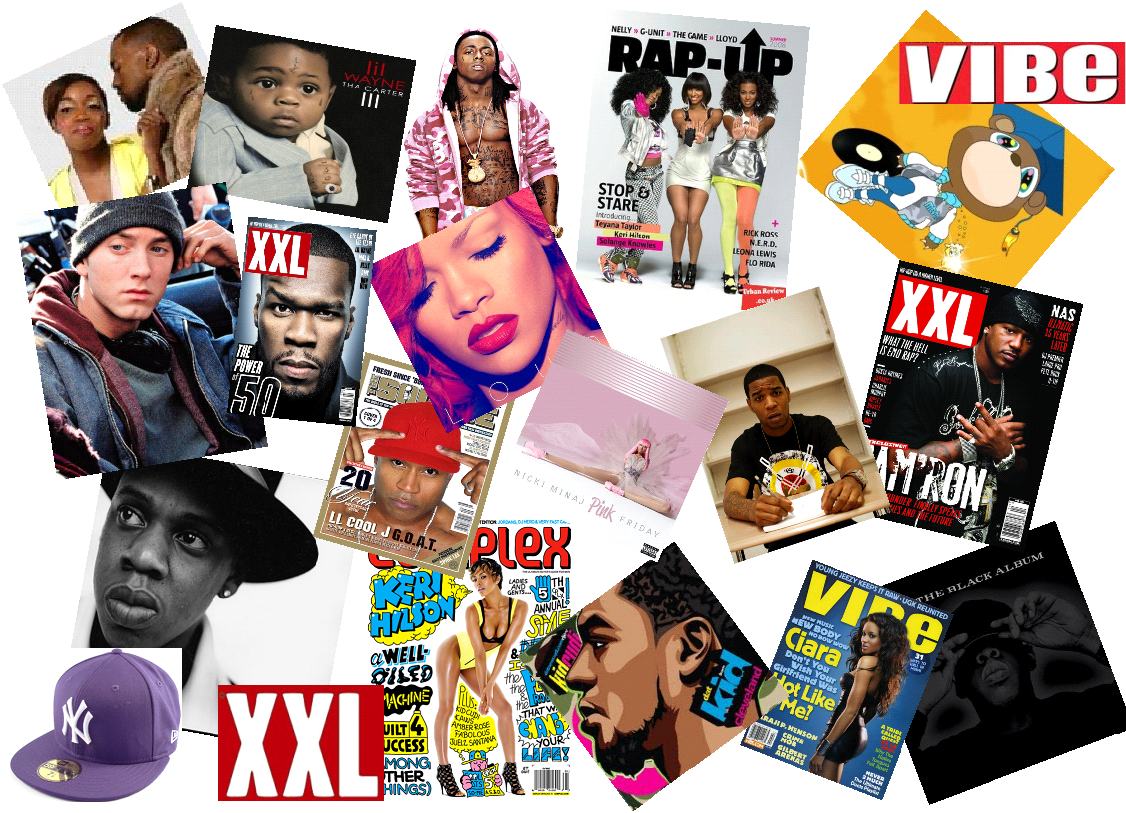
Mood Board!
This is my mood board with some of the artists from the genre of music my magazine is going to be about, and the style of music I like to listen to.
Subscribe to:
Posts (Atom)